• Blog
  • Shop
  • Podcast
  • Resources
  • Archive
  • About
  • Contact
  • Cart
  • Sign In My Account
Menu

The Gentleman Stationer

Vintage Living in the Modern World.
  • Blog
  • Shop
  • Podcast
  • Resources
  • Archive
  • About
  • Contact
  • Cart
  • Sign In My Account

Pen Review: Graf von Faber-Castell Classic Macassar Fountain Pen

February 1, 2023

If there’s one thing that I’ve learned during my near decade in the pen world, it’s that sometimes you enjoy things that you shouldn’t enjoy. What do I mean by that? Well, as a general rule, I tend not to like slimmer pens that don’t post. While there are exceptions, I typically find slim, non-posting pens unbalanced (posting the cap can give an otherwise too-skinny pen a necessary bit of heft), and in any event it can be a hassle to keep track of the loose cap while writing. Did I mention there are exceptions…?

I’ve previously reviewed the Graf von Faber-Castell Classic fountain pen, and enjoyed that pen when I had it on loan, but ended up returning the review sample due to concerns about the dimensions and how well those would work for me as an everyday writer. Since posting that review (back in 2018), I’ve acquired two Graf von Faber-Castell fountain pens, and after a longer test period, held on to both of them in my permanent collection. Of the two (a Guilloche and the pen featured here, the Classic Macassar), the larger Classic Macassar is my favorite.

Graf von Faber-Castell makes fountain pens in a range of sizes. The Classic series, which features most of their wood barrels, is larger than the Guilloche series, shown on the right.

I have a fair number of black-trimmed pens in my collection, ranging from Sailor’s Pro Gear Imperial Black and Black Luster to the Montblanc 149 Ultra Black release from a few years ago, so if I was every going to invest in one of Graf von Faber-Castell’s flagship pens, it would be this one. Featuring an 18k ruthenium-plated nib and PVD-coated titanium trim, the Classic Macassar is stunning to look at. The darker trim perfectly complements the darker Macassar Ebony wood, and like pretty much every other pen I’ve ever tried from Graf von Faber-Castell, the nib writes perfectly. The Company states that each of these nibs is “run-in by hand,” which I take to mean that it’s hand-tested and tuned before it leaves the factory.

The PVD coating on the metal section gives it a nice grip, and the elongated concave shape is exceptionally comfortable.

As I mentioned, design-wise, I shouldn’t love this pen as much as I do. The cap is extremely impractical, but I love the oversized, top-heavy look, and the spring-loaded clip works wonderfully. That said, this pen absolutely does not post. While the Graf von Faber-Castell website shows a photograph of the Classic Macassar posting relatively deeply, my pen barely posts at all, to the point where I don’t even want to post the pen for photography purposes because I don’t want to risk damaging the threads or internal cap. If posting is an absolute necessity for how you use pens, I’d consider the Graf von Faber-Castell Guilloche series, a slightly smaller, slimmer fountain pen that posts more securely.

For comparison purposes, I’ll show a photograph of my Graf von Faber-Castell Guilloche fountain pen, which is a slimmer pen that posts, even if the end result is a touch long for my taste.

Personally, I find that the Classic Macassar is just heavy enough for me to comfortably use unposted, and while the inability to post the cap will likely leave this particular fountain pen outside the “daily Workhorse” category, I’ve had a hard time putting it away. Even though I’ve told myself I should sell it, because it’s not an everyday user for me, I can’t. Do you have pens in your collection that you have some sort of inexplicable draw to, that you enjoy using even though it’s a pen that your experience tells you that you absolutely shouldn’t like, but you do anyway? Well, this is one of those for me.

The Graf von Faber-Castell Classic Macassar in-hand.

Takeaways and Where to Buy

Though an exceptional fountain pen with a unique look, like most GvFC products, the Classic Macassar retails at an extremely high price point. As of the time of writing, MSRP on this pen is $685 as shown on the Graf von Faber Castell US website, with most retailers having it priced around $550. That’s expensive, but then again, on par for a ruthenium-plated nib pen with blacked out titanium parts. (Compare with the Sailor Pro Gear Imperial Black, which now lists for $472, or the Montblanc 146 Ultra Black, which apparently has a secondary market value north of $1200?) Whether the pen is "worth it” to you goes far beyond practicality - for me, the combination of black trim and dark wood, as well as the wonderful writing experience offered by the Graf von Faber-Castell Classic pens in general, keeps this one in my collection.
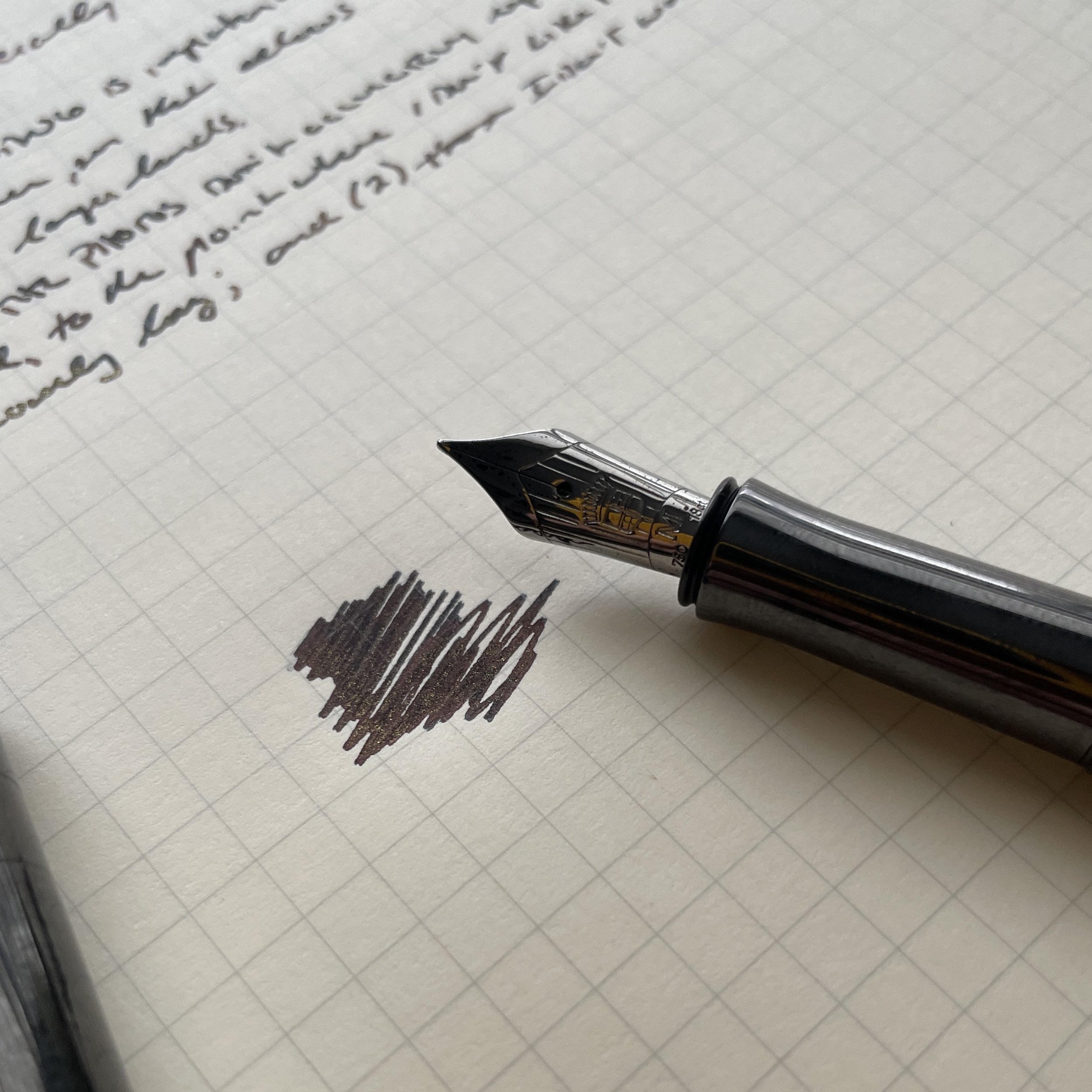
For this review, I chose to ink this Graf pen with Ferris Wheel Press Roaring Patina Black, and the review paper is the excellent Life Noble Note.

I acquired this pen years ago, and can’t remember exactly where (though it was probably either Appelboom or the now-closed La Couronne du Compte). This post does not contain third-party affiliate links or advertising. The Gentleman Stationer is supported entirely by purchases from the T.G.S. Curated Shop, and pledges via the T.G.S. Patreon Program.
In Pens Tags Graf von Faber-Castell, Fountain Pen, Fountain Pens
5 Comments

Spotlight on Nahvalur Fountain Pens: Introducing the Year of the Rabbit Limited Edition

January 31, 2023

Last year we brought Nahvalur (formerly Narwhal Pens) into the shop, driven by two specific models: the “Original Plus” vacuum-filler fountain pen and the “Nautilus” piston filler, featuring Nahvalur’s signature “porthole” ink windows. This week, we’ve not only restocked on the Original Plus but have added two new Nautilus fountain pens and will soon add Nahvalur’s new “Explorer” ink line.

Nahvalur 2023 “Pen of the Year” is Now Available

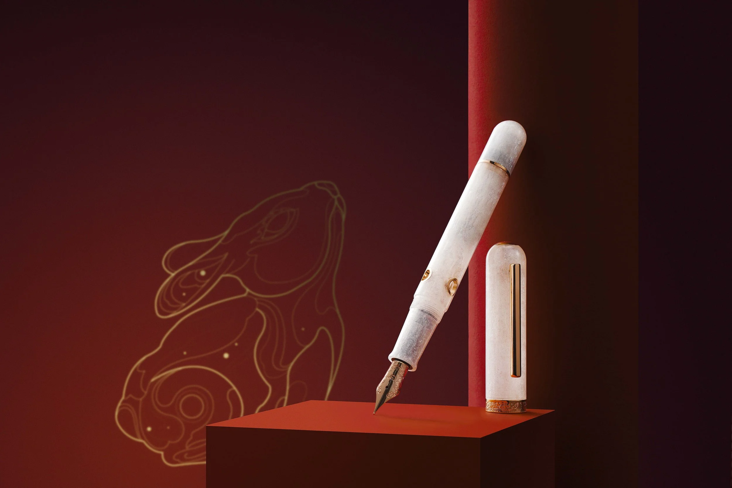
The big announcement this week is the release of Nahvalur’s 2023 Pen of the Year, the “Year of the Rabbit” limited edition Nautilus. Featuring a pearlescent white resin and a 14k gold nib, this release is limited to 223 pieces worldwide and we were lucky enough to get a handful. Available in either fine or medium.

The white resin used in the Year of the Rabbit pen comes from Starry Night Resins.

As I mentioned above, we’ve also added the classic black Nautilus ebonite piston filler featuring either an antiqued bronze (“Bronze Corydoras”) or black (“Cephalopod Black”) trim, and we once again have all colors of the “Original Plus” fountain pens in stock, including the popular Ocellatus Gold which sold out quickly.

It’s Restock and New Arrival Season, So Keep Checking Back

We have new products arriving daily, so keep checking back to view the new arrivals in pens, inks, and pencils as well as paper and notebook systems!

The T.G.S. Curated Shop is an authorized retailer of all brands sold.

In TGS Curated Shop Tags New Release, Nahvalur, Nahvalur Nautilus
Comment

Four No. 8 fountain pen nibs, from left: Jinhao x159; Conid Bulkfiller Kingsize; Montegrappa Extra 1930; Montblanc 149.

"Serious Nibbage": Do No. 8 Nibs Live Up to the Hype?

January 28, 2023

Every year, there are a couple of products that see their popularity soar unexpectedly, despite the fact that the’ve been around for a while. In 2022 - and continuing into 2023 - one of those product categories is the No. 8 fountain pen nib. For those unfamiliar with fountain pen nib sizing schemes, the size of the nib itself (as opposed to the tipping) is denoted by number. Different regions (or even brands) will use their own numbering so there is little overall consistency, but for purposes of this article, the generally accepted “standard” nib size is a No. 6 (i.e., your typical JoWo or Bock nib), with the larger No. 8 rapidly growing in both popularity and availability.

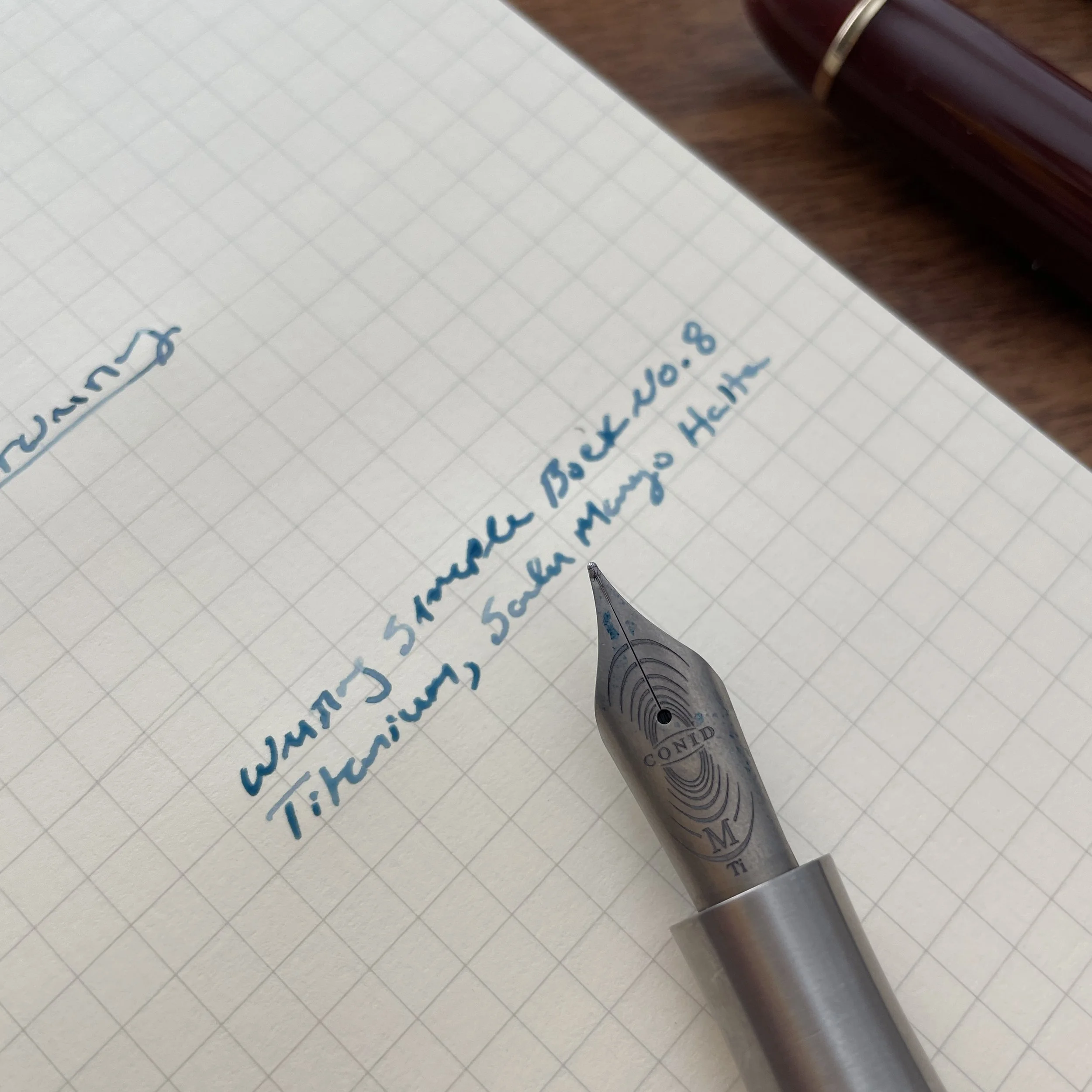
If what you’re looking for is a bouncy, wet writer, a Bock No. 8 titanium nib, like the one on the Kingsize Bulkfiller, will serve you well. You also don’t need to pay Conid prices to get one. They are available separately from many different sources and can be fitted to pens like the Schon Ultem, provided you have the appropriate section. More on that below.

Why Do People Like No. 8 Nibs So Much?

A No. 8 nib just looks different. Part of the appeal is the uniqueness factor. The experience of writing with a nibbed pen adds much of the charm to using a fountain pen in general, and the larger No. 8 nib is especially eye-catching. The first time you see a pen like the Montblanc 149 or the Pelikan M1000, what you notice is that giant gold nib. Other companies, like Conid, offer gold but increasingly the standard No. 8 nib for small-batch and custom makers seems to be the less expensive No. 8 Bock titanium nib, with a matte finish that pops in its own way.

A smoother writing experience. Many people who first recommended No. 8 nibs to me commented on how much smoother they feel, and to a certain extent they’re correct. I suspect that the “smoother” feel comes from the larger feed, which if tuned properly will deliver more ink, which in turn makes the nib write “wetter,” and a wet nib typically feels smoother than a dry one because it masks any rough spots on the tipping or tine misalignment. If you like wet nibs with a bouncier feel, you will probably enjoy Bock No. 8 titanium nibs, which deliver a lot of ink and provide some line variation.

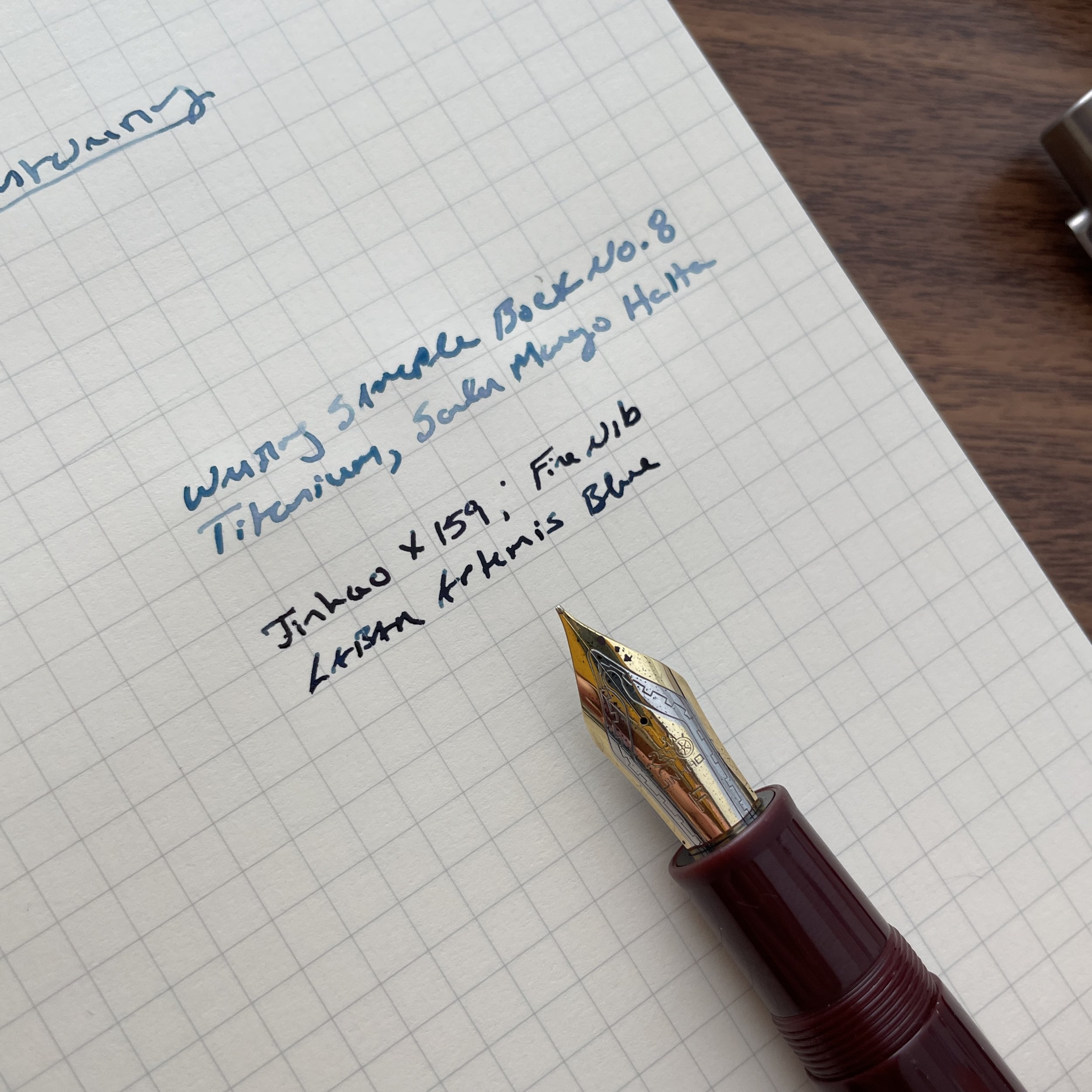
More stability and control. Personally, I appreciate No. 8 nibs for the same reason that larger pens are growing on me: a greater degree of stability and control over my writing. The larger nib feels more precise in your hand, especially with a finer nib like the one on the Jinhao X159 discussed below.

The pen on the left costs $1100. The pen on the right costs $12.50. As you can see, you don’t need to break the bank for the No. 8 writing experience.

Less Expensive No. 8 Nib Options Are Becoming More Widely Available

Currently, I have four No. 8 nibs in my collection: A Montblanc 149 with a broad nib (that writes more like a stub); a Montegrappa Extra 1930 with a medium nib; a Conid Kingsize Bulkfiller with a medium titanium nib (review forthcoming); and a Jinhao X159 that just arrived the other day. Of these four, the one that surprised me the most was the Jinhao. I love it when I discover extremely inexpensive pens that are fabulous writers, and while this stiff nail of a steel nib won’t give you the same wet writing experience or bouncy feel as the others discussed, for $12 I’m not sure you’re going to care. Because these larger Jinhao nib units are threaded and unscrew from the pen, I’ve heard that penmakers are starting to experiment with Jinhao-compatible sections, which will allow you to use these nibs in custom pens. Another less expensive option are the Magna Carta stainless steel nibs, which I’ve heard are compatible with the No. 8 sections made for the Schon DSGN Ultem pens. (UPDATE: See comments below, as people have had mixed success with Magna Carta. What I’ve heard is that the recent batch works with the Ultem pens, but YMMV.)

Jinhao-X159-Writing-Sample

The Jinhao X159 writes a smooth, dark line. The writing experience offered by this pen punches FAR above its price point. The body of the pen does feel pretty inexpensive - even cheap (which it is), but the nib is superb.

Stay tuned for more No. 8 nib-specific content, specifically how these options all compare to one another. I’m planning on picking up some No. 8 sections for my Schon pens during this year’s pen show adventures, and I’m also looking forward to trying out the JoWo No. 8 nib, featured on the Edison Collier Grande.

Enjoy reading The Gentleman Stationer? We are supported entirely by purchases from the T.G.S. Curated Shop and pledges via the T.G.S. Patreon program. This post does not include paid advertising or third-party affiliate links.

In Editorial Tags Nibs, No. 8 Nib, Fountain Pens, Serious Nibbage
7 Comments

* This is not a scientific poll, and is intended for entertainment purposes only. Statisticians please don’t come at me.

What's the Most Popular Nib Size? By a Wide Margin, It's Fine or Medium.

January 25, 2023

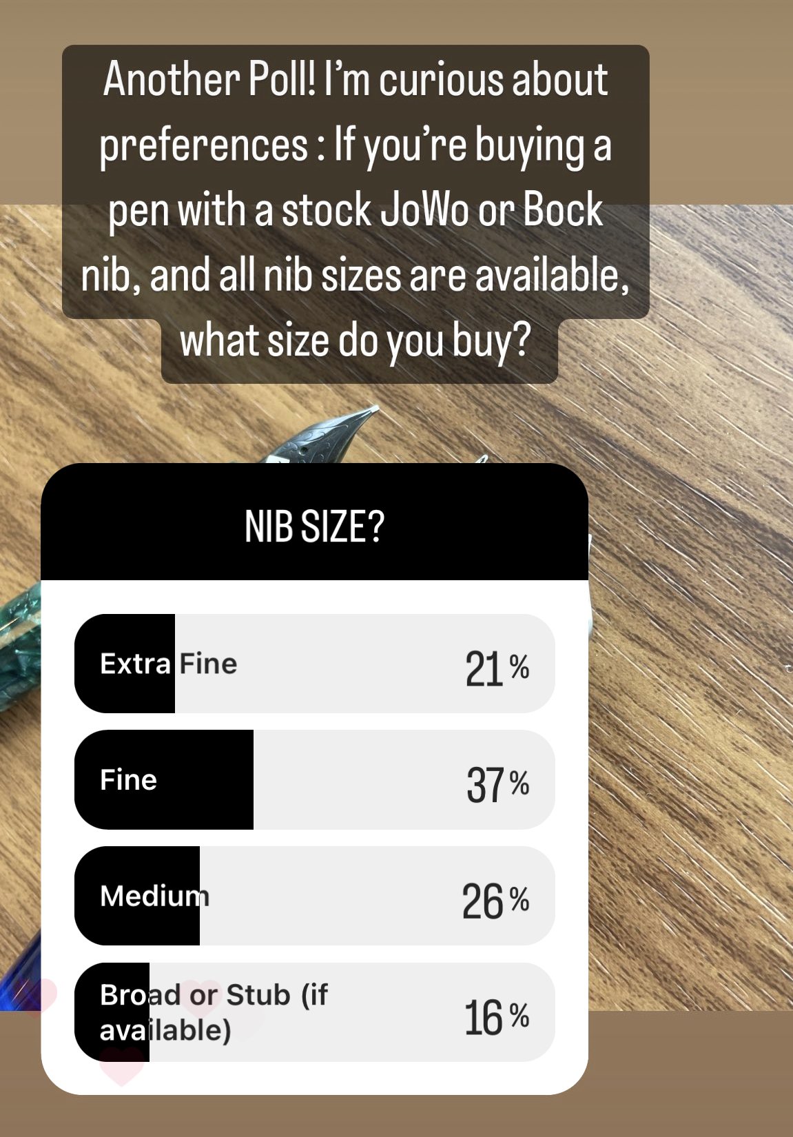
Sorry broad-nib lovers, but the numbers don’t lie.* You may have noticed that I’ve been doing some surveys lately, both via Patreon and via Instagram, and it’s for several reasons. First of all, I’m always curious about people’s preferences and what they use for their everyday writing. Second, I’ve noticed that as many as 65% of the pens I sell are fines and mediums. If that holds as true, my buying strategy of stocking up on equal numbers of all nib sizes probably isn’t the best idea, especially as I bring in more pen lines and invest in more expensive inventory. So I posed the question: If you’re purchasing a pen to use unmodified, in one of the “default” nib sizes of extra-fine, fine, medium, broad, or stub, what size do you prefer?

Here are the results (which as of the time of writing are still preliminary on Instagram, but overall consistent with data I’ve seen elsewhere so I have no problems going ahead and posting my conclusions):

  • On T.G.S. Patreon, 75% of respondents chose fine or medium. The other 25% chose broad, stub, or wider (if available). Surprisingly, nobody chose extra-fine.

  • On Instagram, as of the time of writing, 63% chose fine or medium. 16% chose broad or wider, and 21% chose extra-fine. The Instagram results are probably more reflective of the community at large, as it’s a bigger sample size.

More mediums and more fines. Based on a survey of my own collection and what nibs I currently have in most of my pens, I seem to be pretty “average” in terms of what I use on an everyday basis.

As I noted above, anyone with rudimentary training in statistics could find multiple ways to criticize this poll, and it’s neither intended to be scientific nor taken completely seriously. When I posed the question, I also framed it around “stock” nibs that are generally universal across brands, as there’s a lot of variation between different companies’ in-house nibs. But let me say this: the results of this poll are 100% consistent with what I see going out the door in my shop, so at a minimum the responses are a pretty accurate reflection of the nib preferences of The Gentleman Stationer readership. One of the fun parts of being a retailer is having a bit of insight into what people actually buy, as opposed to what gets the attention on blogs, social media, and podcasts. If you follow pen-related social media at all, you might be forgiven for thinking that most true fountain pen enthusiasts write only with broad nibs or stubs - nibs that lay as much ink as possible on the page - or microscopically small needlepoints. While many people certainly enjoy having a few unusual nibs in their collection, those of us who are forced to go out into the word and write on what passes for “office paper” these days recognize that’s not a sustainable approach to modern life.

For me, it’s medium nibs all around, and I have never had any issues having a medium nib ground into a cursive italic or stub (like the Franklin-Christoph medium S.I.G. nib on the left).

Personally, I default to purchasing pens with medium nibs. A medium is broad enough to show off ink without soaking a page of copy paper, and usually still has enough tipping to support a nib grind. That said, I have so many medium nibs in my collection - including handfuls of loose JoWo and Bock nib units - that I’ve recently taken to purchasing broad or double-broad nibs solely for the purpose of accumulating a ready stock of nibs for modification. Nahvalur nibs in particular have a LOT of tipping, so if you’re purchasing a pen with the specific intention of getting a specialty nib grind, keep that in mind. In San Francisco, I had C.Y. of Tokyo Station Pens modify my Double-Broad Nahvalur Nautilus into a Naginata-style grind, with an excellent result.

I’m still interested in hearing directly from readers: What factors do you consider when selecting a nib? Why do you prefer one nib size over another? Please feel free to leave a comment or send me an e-mail!

Disclaimer: The Gentleman Stationer is supported entirely by purchases from the T.G.S. Curated Shop and pledges via the T.G.S. Patreon Program. This post does not contain paid advertisements or third-party affiliate links.
In Editorial Tags Editorial, Poll, Survey, Nibs
2 Comments

Spotlight on Midori MD Notebook Journals: A Wealth of Versatile Formats

January 24, 2023

So far this year, posts on journaling have received a lot of traffic (and comments!), and journals are flying out the door in the shop. It’s encouraging and gratifying to see so many people enjoying analog journaling, and even if I haven’t been able to respond directly to all of your comments, I’ve enjoyed reading them, especially the comments discussing all of your journaling styles, methods, and prompts.

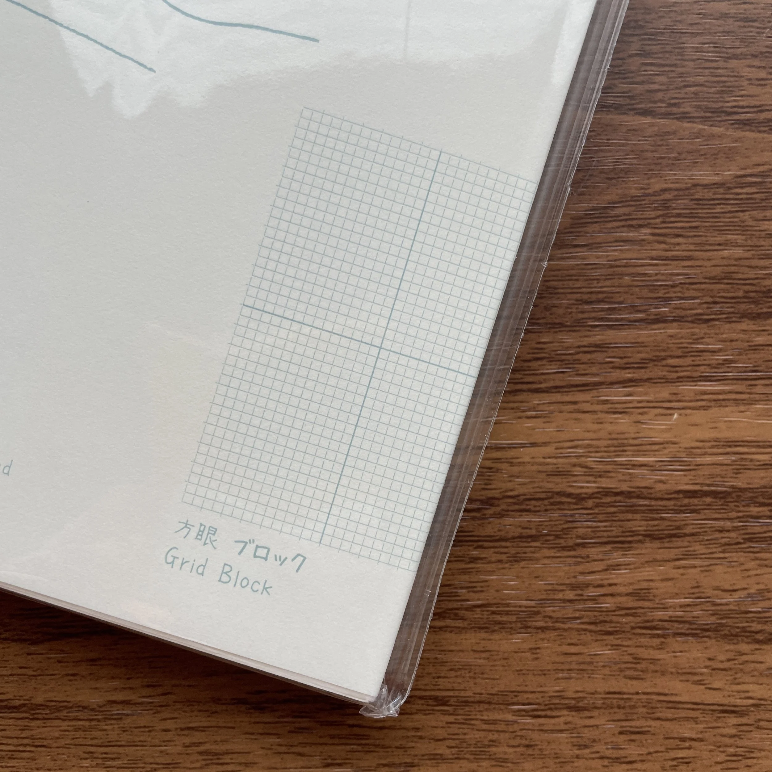
I can see myself using the Grid-Block Notebook Journal as a Planner: you will have eight “boxes” on two pages facing one another, so you can use a box per day plus a section for notes or a bullet list?

While we carry a lot of notebooks appropriate for journaling (and pretty much any notebook can be made to work as a journal), the Midori MD system is the most popular. In addition to the standard MD “notebooks” in lined, grid, and blank formats, Midori also sells A5 notebooks that they bill as “Notebook Journals,” which come in different layouts that many find helpful for creative journaling. Of course, the dot-grid version is a favorite (and probably our overall top-selling Midori MD Notebook), but the A5 “Frame” version is also popular with those who draw, paint, or paste in photographs and other mementos. The newly arrived A5 “Grid Block” notebook is the most interesting to me, as it divides each page of grid ruled paper into four quadrants. The Midori MD Notebook Journals are the same size as the standard A5 MD Notebook, so they are compatible with Midori MD Covers and other accessories.

Traveler’s Company Brass Index Clips and other Traveler’s Company/Midori Accessories enable you to organize your journals and notebooks.

Of course, for those who journal regularly and want a true day-to-a-page notebook in a single volume that will stand alone by year, the Midori MD Codex will remain the gold standard. We have Codex journals in both Dot Grid and Blank formats, along with the clear plastic covers. (Note that the Codex journals do NOT fit the standard MD Paper or Leather covers, which are intended for the slimmer MD Notebooks and Notebook Journals.) You can check out our full range of Midori paper offerings here, in addition to matching pens and pencils.

The T.G.S. Curated Shop is an authorized retailer of all brands sold, including Midori and Traveler’s Company.

In TGS Curated Shop Tags Midori MD, Midori MD Notebook Journals, Journaling, T.G.S. Curated Shop
Comment
← Newer Posts Older Posts →
Store Hours and Events
Shop T.G.S. Online
Updated 2026 "Best Pens" Guide
No results found
On The Paper Trail: Live In Nashville Event Tickets Now Available!
TGS_25 Roterfaden Restock Notification
Hierarchies of Fountain Pen Friendly Paper

Join Our Patreon!
Subscribe to the TGS E-mail List

Featured Posts

Featured
10-Fountain-Pens-Favorite-Inks
August 22, 2026
Three Keeper Inks: Choosing Inks for 10 Fountain Pens
August 22, 2026
Read more →
August 22, 2026
Everyday-Stationery-Bags
July 25, 2026
What's the Best Everyday Stationery Bag? My Own Considerations and 5 Options for Pen Show Season
July 25, 2026
Read more →
July 25, 2026
Graphilo-Kobeha-Paper.jpg
July 11, 2026
Paper Review: Graphilo by Kobeha
July 11, 2026
Read more →
July 11, 2026
The Gentleman Stationer RSS

View Cart

© Digital Divide Media, LLC, 2014-present.

All content is the exclusive property of Digital Divide Media, LLC, d/b/a The Gentleman Stationer, including “The Gentleman Stationer” website and trademark, and should not be reproduced without express written permission.  All rights reserved.

All content containing paid advertising, affiliate links, or sponsored content will be plainly disclosed by a disclaimer when/if featured.

Contact Information

Website Terms and Conditions

Store Shipping Policy and Return Policy

Privacy Policy and Cookie Policy

Accessibility Statement

Powered by Squarespace